This page will contain some short descriptions and cutouts from the one page design document I created for the game Root of Guilt. I will attempt to shortly explain what the purpose was for each cutout and which effect it had on the game as a whole.
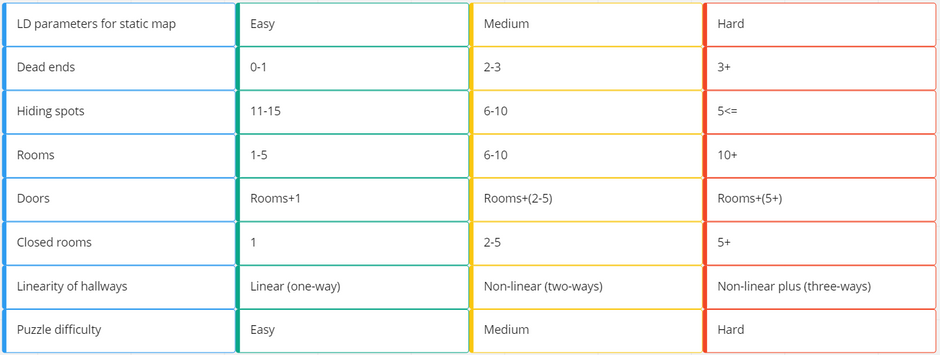
As a part of the course DADIU, I was sent on a game design course with a mentor from the danish game development industry. During this course I was introduced to the concept of Rational Game Design and Rational Level Design. These concepts have the purpose of identifying atomic parameters which are the most basic parameters that drive the game. Using these concepts, the goal was to control the flow of the player experience, as well as making it easier to balance in future iterations of the game. The following two cutouts from our excel sheet, shows the initial setup of our atomic parameters for the game Root of Guilt.
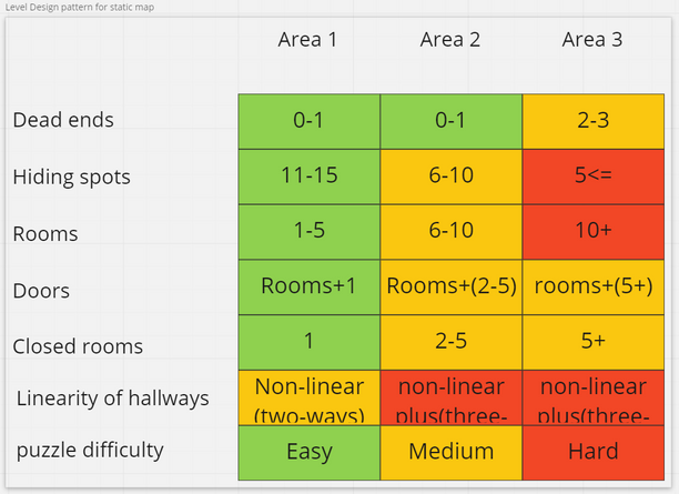
Using the parameters defined for the static map, I created a more detailed writeup for how the static map could be divided. In this writeup, I try to divide the map into three areas, with increasingly more difficult parameters. I hoped to balance the players' experience over time, with the game's increase in difficulty over time, thereby sustaining a flow state.

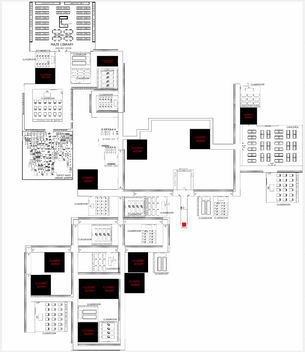
From the parameters I defined in the previous writeup, I ended up with a visual representation of our game map that looked like this. This map would be iterated upon multiple times during the game development process, and you can see the different maps later on this page.
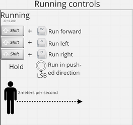
One of the first team interactions I had during the development of Root of Guilt was with the programming team. The programmers explained that the first thing they would like info about, would be the games control scheme. This was so they could get a basic player controller going within the game.
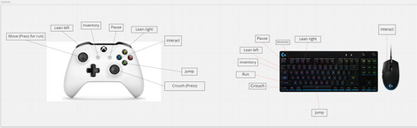
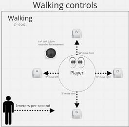
Since I wanted the player to interact with the game in two different movement states, I defined the controls for both the walking and running states.
Along with the description of the movement controls, I added the initial parameter of movement speeds for the two states. By supplying the two states of movement and the parameters early on, it would be easier to modify later in the development of the game.
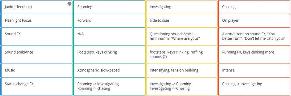
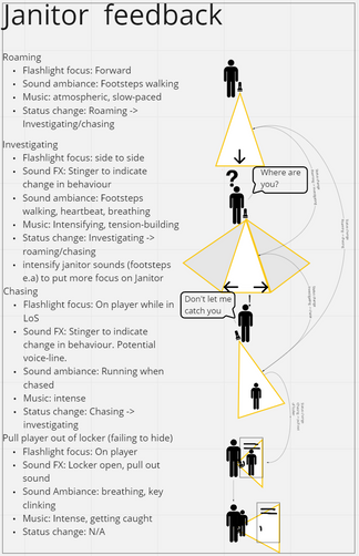
The antagonist of the game Root of guilt, would be the Janitor. An NPC whose sole purpose is to hunt down the player. We needed a clear description of the antagonists behavior, and feedback. This helped the programmers, artists and audio designers to know what was needed so they could start developing the game.
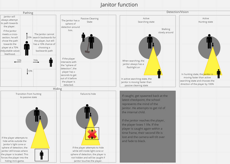
Later in the process, we chose to make a more indepth version of the antagonist description. This version included some details in flashlight movement. It also included how the audio would change depending on the current state of the antagonist.
The descriptions of the antagonist functionality was very much done by utilizing feedback from different parts of the development team. This description was iterated upon during the whole development process.
I could probably write ten more paragraphs on how the antagonist works, but in the interest of keeping things short, this is where I will stop for the antagonist.
In the description of the antagonist, I ended up describing three different states. The antagonist starts off in the passive state. In this state, the antagonist is pathing around the map following a set of rules. These rules I described as the Pathing rules. I wanted to prevent the antagonist from simply pathing in the opposite side of the map from the player. I also wanted to create a feeling of the antagonist always being nearby. So, I described how the antagonist would behave at each intersection of the map, in such a way that the antagonist would have a 70% chance of picking the path leading towards where the player currently is. Once the antagonist is alerted, by the player being within his searchlight for a set time, the antagonist enters the searching state. This state increases his movement speed, but the pathing rules still apply. The last state of the antagonist is the Hunting State. This state is activated by the player remaining within the flashlight cone for a certain amount of time. Once the hunting state is activated, the game enters a procedurally generated world which can only end once the player successfully hides in a locker.
One of the most important things for me, during the development of any game. Is to ensure that the player always knows what is going on. This is primarily done through a series of different feedbacks. These include visual and audio as well as haptic feedback for people using controllers.
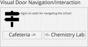
Along with the maps, we also opted for adding a hospital-like navigation feature. We added large signs at most intersections, pointing towards rooms that are points of interest. The maps at procedural exit doorways together with the sign navigation system, potentially proved effective since we did not get any feedback of players getting lost. More testing is needed to bring this point home.
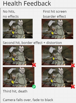
I defined a health and damage feedback system. This would be a way of informing the player about their current health points. I wanted the player to have two health points within the easy version of the game. This would allow us to make the game harder in the future, by reducing the number of hits the player could take. The health points would be visualized by a screen and border effect of redness, as well as a grayscale effect. Sadly we never got around to introducing difficulty to the game, and as such the feature was not needed.
In the development of the game Root of Guilt, we implemented procedural generated chase hallways, which the player would be seamlessly teleported into when triggering a chase sequence with the antagonist. An issue I pinpointed with this feature was the players returning to what we called the static map. Here the player is spawned in a random "procedural exit", which are doorways placed around the map. The player would have a high potential for losing their sense of space in the world. I opted for introducing maps in the game world, at all the procedural exit doorways, with a "you are here" marked.
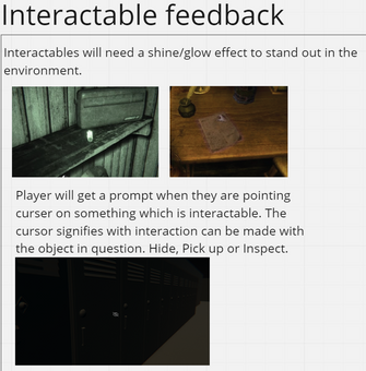
To ensure that players understood which world objects were interacterable, I designed two separate visual feedbacks. If the player would hover their cursor over the object, while being within range, the cursor would change depending on which kind of interaction was possible. These interactions include, locked doors, unlock door, hiding place, inspectable object and pickups. The second visual feedback was in the form of a shiny shader placed on objects which could be interacted with. The shiny shader would hopefully draw the players attention to the object, while the cursor would inform them of which action would be possible. This feature was inspired by different games, like the hiding icon in Skyrim or the hand cursor in the game Amnesia.
As a part of the antagonists function, we needed a method of dropping the attention of the antagonist. The dropping method of running away was initially found to be boring as it did not really require any world interaction. I wanted to introduce a hiding mechanic to the game which would require the player to interact with the world. I contacted my QA/UR coworker with the intention of having some competitor research performed. My coworker returned to me with a series of different methods found within other games. The games Alien Isolation and Little Hope, were primarily my inspiration sources.
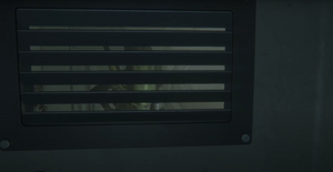
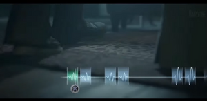
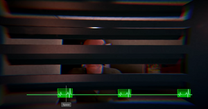
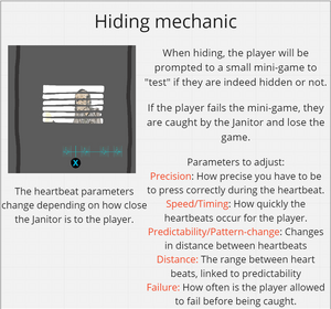
I liked how Alien Isolation had the player interact and hide within game world objects. So I set my sights on the ability to hide in lockers. I also liked how the Alien would be visible outside the locker, since it increased the tension of the situation. I did feel like there was something missing while the player was hiding in the lockers. Some kind of player interaction was needed. So I took inspiration from the heartbeat minigame found in Little Hope. By combining these two, I believe we managed to create a tense situation for the player. I would definitely want to develop this feature even more if this game was going to be something bigger. It became clear that repeated introductions to this mechanic made it tedious and less tense.
I wanted the player to get more out of the game than just being chased around by the antagonist. I devised a couple of puzzles. One of these puzzles would be placed within the world where the antagonist was pathing, allowing for player intersection during the puzzle. The second puzzle was created as a short respite for the player, where they could relax a little by performing a mental exercise.
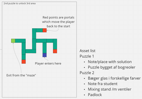
The second puzzle was originally designed to be part of the second area. In the revised map, this puzzle would be placed in the first wing of the school, which the player searches through. This puzzle is a requirement to reach the key which is needed to access the second wing of the school. The idea of this puzzle was to utilize non-euclidean geometry in some way. I came up with the idea of a library section that would continue forever, unless the player chooses the correct turns. A note was placed at the start, containing the letters "L, L, R, L". If I had more resources to work on this project, I would have liked to increase the size of this labyrinth. Players either found the note too easy to understand, or simply just guessed the correct path in the first go.
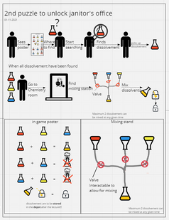
The first puzzle was designed to be the puzzle located in the last area of the map. After some map iteration, this puzzle ended up being the overall first objective of the map. The player will have to find three vials of mystery liquid. The player will also need to find the correct combination of these vials, to create the concoction needed to finish the game. Somewhere on the map, the player can find what this combination is, or the player can simply brute force it.
Along with all the other features of a game, we also had to attempt the design of the UI. I am not the most artistic person, so this was a fun challenge. We started out defining a wireframe setup of the essentials for a functional game. After this, I brought in the art team so we could collaborate on the visuals of the UI. I have found that it is an asset to understand one's own limits. And it is essential to rely on your team in situations which overlap these limits.
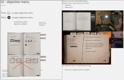
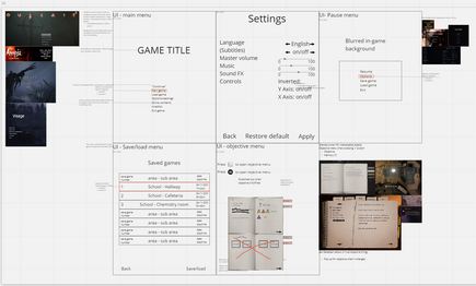
When creating the wireframes for the UI, I made sure to utilize inspiration from other sources. These hopefully helped the art team to understand where I was going with the design. I wanted to create a UI design which deviated as little as possible from the game world. In this interest, I designed the objectives menu as a notebook that the player character could have with him.
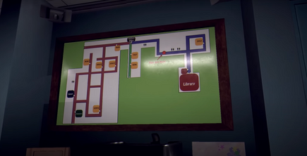
The game map was one of the features which I iterated on the most during our game development. The map functioned as a tool to tell the player's experience through the game. And as such, I would often find points of interest which needed a tweak or two, or the game director would contact me about the size or design of the map. The first map I created was designed with the static map parameters in mind, from the cutout at the top of this page. The map is divided into three regions. Easy, Medium and Hard. The idea was to control the player experience throughout the game. I added a legend to the map, to make it more understandable for everyone in the team.
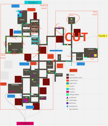
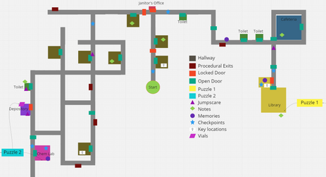
I sat down and created a third edition of the map. This version still had the three areas of easy, medium and hard. But it was more detailed than the first edition. I created a legend which could detail the location of all the points of interest, and made sure to utilize both colors and shapes to differentiate between legend entities. This map proved very useful for the entire team, in talking through the player experience, and choosing where to introduce certain experiences during gameplay.
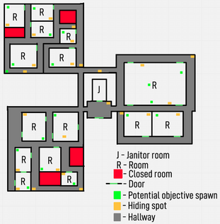
After cutting a lot of the fourth edition map out, and reducing the size of walkways as well as the number of rooms. I ended up with the final map of our production. Having a map which visualizes the game's map entirely, while still being simple and easy to understand, was an invaluable tool. I often stood around this map with the other designers or teams, emulating a player going through our map while experiencing the story. This helped with finding issues before resources were spent on creating features.
After some feedback from the game director, it was concluded that the first edition of the map was not sufficient in detail. I contacted the art team and sat down with one of them to create the second edition. After talking with the game director, we agreed that I should revert back to the previous way of visualizing the map, since the second edition ended up being unnecessarily detailed. We needed a map which could detail points of interest, but was still simple enough to look at.
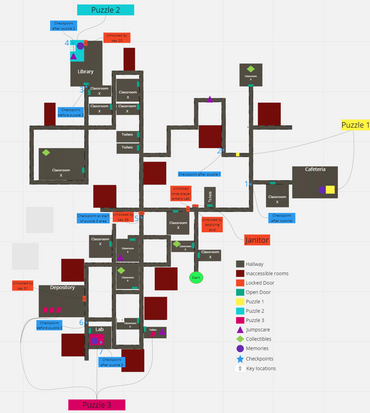
Later in the production, it became evident that we had to cut down the game scope to meet the deadline. I was therefore asked to reduce the size of the map and try to keep the player experience. To do this, I chose to cut out the entire easy section, and rotate the medium section down, to prevent any unnecessary long pathways between areas.
I dream of working in the game industry, and help create products which entertain and inspire people. Hopefully the info on this page reflects this wish. Contact me using the button below if you have any questions about me, my projects or any other inquiry you might have.

